Developing a Consistent
Design Language
DEVELOPING A CONSISTENT DESIGN LANGUAGE
For a global shoe retailer
For a global shoe retailer
Objective
To create a system of styles and components to be used for designing and developing a cohesive e-commerce product.
Create a system of styles and components to be used for designing and developing a cohesive e-commerce product.
Create a system of styles and components to be used for designing and developing a cohesive e-commerce product.
Outcome
Development of a process that fostered more communicative production and more efficient problem solving, all leading to a familiar, intuitive customer experience.
Foster more more communicative production and more efficient problem solving that all lead to a familiar, intuitive customer experience.
Foster more more communicative production and more efficient problem solving that all lead to a familiar, intuitive customer experience.
Year — 2019/2020
Year — 2019/2020
Year — 2019/2020
Company — DSW
Company — DSW
Company — DSW
Type of Work — UX design
Type of Work — UX design
Type of Work — UX design
Role — UX designer
Role — UX designer
Role — UX designer
Overview
After six solid months of feature development, the DSW UX team began noticing redundancies and disparities in our designs. This is the case for many product teams – rapid design work with little reflection leads to an incoherent customer experience.
As someone who enjoys making sense of a mess, I was tasked with identifying inconsistencies in our design and the website at large, then consolidating them into one, definitive system.
Standardizing the Product
To start, I gathered all the UX team’s designs to date in one place. We had worked with some shared styles and components, but seeing everything at once revealed very different treatments. What we needed were standards.
To start, I gathered all the UX team’s designs to date in one place. We had worked with some shared styles and components, but seeing everything at once revealed very different treatments. What we needed were standards.
To start, I gathered all the UX team’s designs to date in one place. We had worked with some shared styles and components, but seeing everything at once revealed very different treatments. What we needed were standards.
10
10
10
Pages and dozens of components from the site UX analyzed
Pages and dozens of components from the site UX analyzed
Pages and dozens of components from the site UX analyzed
Screens compiled in the UX audit
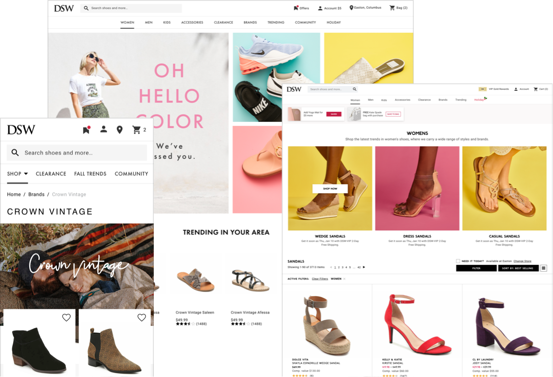
Design System Version 1.0
Referencing the inventory, I worked with designers and developers to decide on which elements to keep and then documented them in a shared library of type, color, icon, and basic component styles.
Referencing the inventory, I worked with designers and developers to decide on which elements to keep and then documented them in a shared library of type, color, icon, and basic component styles.
Referencing the inventory, I worked with designers and developers to decide on which elements to keep and then documented them in a shared library of type, color, icon, and basic component styles.
Catalogue of UI design elements
Maturing The System
The UX team tested the library by using it in our day-to-day design work. Additionally, I took inventory of the DSW site experience to see how much of it our system accounted for.
The UX team tested the library by using it in our day-to-day design work. Additionally, I took inventory of the DSW site experience to see how much of it our system accounted for.
The UX team tested the library by using it in our day-to-day design work. Additionally, I took inventory of the DSW site experience to see how much of it our system accounted for.
Screens compiled in the UX audit
Though the library helped us design more efficiently, there were several opportunities to mature the system and ensure a 1:1 between UX standards and the developed product.
Though the library helped us design more efficiently, there were several opportunities to mature the system and ensure a 1:1 between UX standards and the developed product.
Though the library helped us design more efficiently, there were several opportunities to mature the system and ensure a 1:1 between UX standards and the developed product.
Areas For Improvement
01 — Reconsider proportions of typography including how it adapts to devices and contexts
01 — Reconsider proportions of typography including how it adapts to devices and contexts
01 — Reconsider proportions of typography including how it adapts to devices and contexts
02 — Better define application of color
02 — Better define application of color
02 — Better define application of color
03 — Incorporate interactive states
03 — Incorporate interactive states
03 — Incorporate interactive states
04 — Correlate styles with how they’re applied in code
04 — Correlate styles with how they’re applied in code
04 — Correlate styles with how they’re applied in code
05 — Apply standards to more complex components like modals and entire forms
05 — Apply standards to more complex components like modals and entire forms
05 — Apply standards to more complex components like modals and entire forms
The DSW Design System
Through design, development, and continued refinement, the UX team created a system of unified styles and components. In practice, the system facilitated a shared concept of product appearance and functionality which led to more cohesive designs and more meaningful problem solving.
Through design, development, and continued refinement, the UX team created a system of unified styles and components. In practice, the system facilitated a shared concept of product appearance and functionality which led to more cohesive designs and more meaningful problem solving.
Through design, development, and continued refinement, the UX team created a system of unified styles and components. In practice, the system facilitated a shared concept of product appearance and functionality which led to more cohesive designs and more meaningful problem solving.
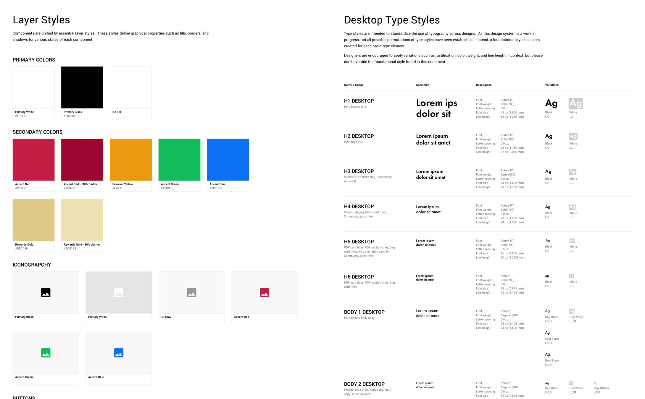
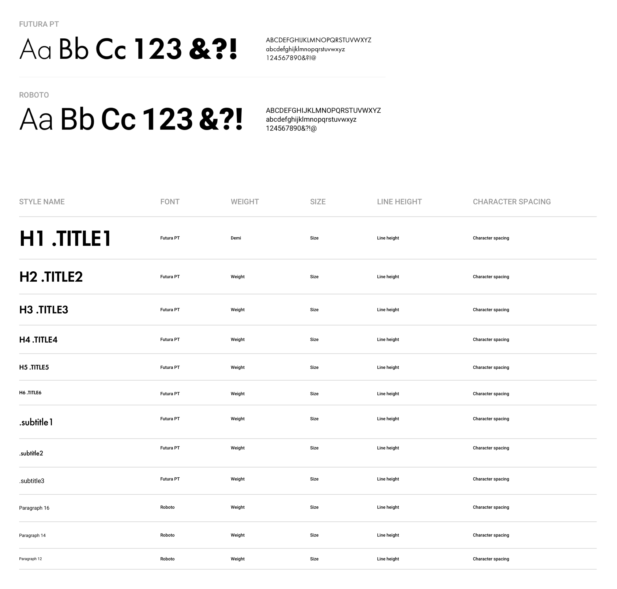
Dynamic, Expressive Typography
One heading and one paragraph typeface prioritize legibility and modern expression while scaling intuitively.
One heading and one paragraph typeface prioritize legibility and modern expression while scaling intuitively.
One heading and one paragraph typeface prioritize legibility and modern expression while scaling intuitively.
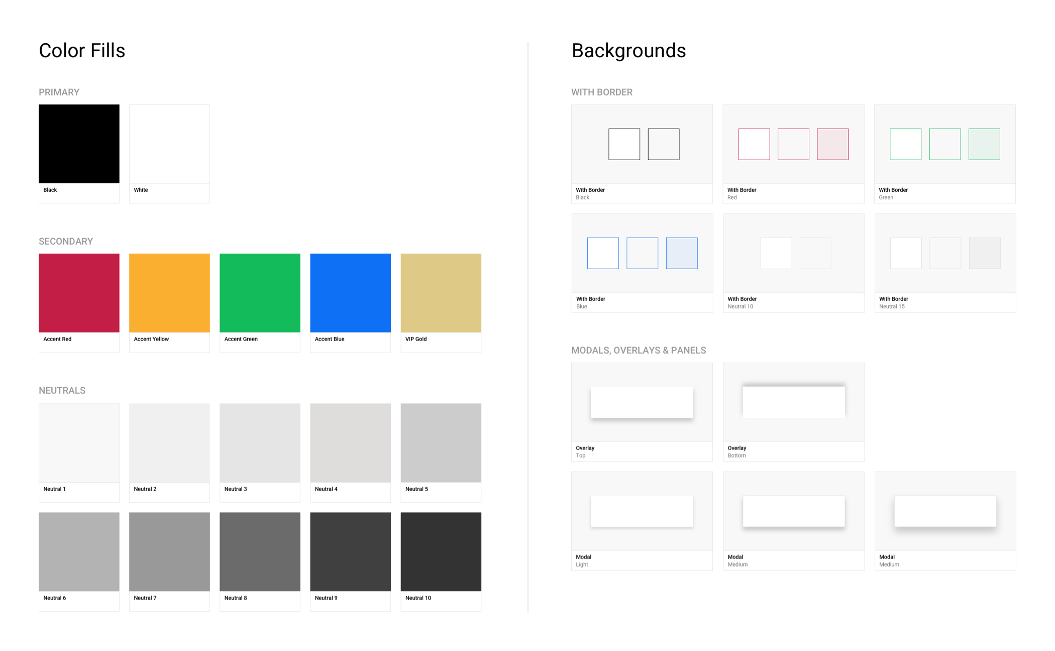
Purposeful Colors & Stlyes
Purposeful Colors & Stlyes
Purposeful Colors & Stlyes
With a primarily black-and-white aesthetic, color serves as a communication tool to indicate state changes, errors, and success as neutral values add depth to UI elements.
With a primarily black-and-white aesthetic, color serves as a communication tool to indicate state changes, errors, and success as neutral values add depth to UI elements.
With a primarily black-and-white aesthetic, color serves as a communication tool to indicate state changes, errors, and success as neutral values add depth to UI elements.
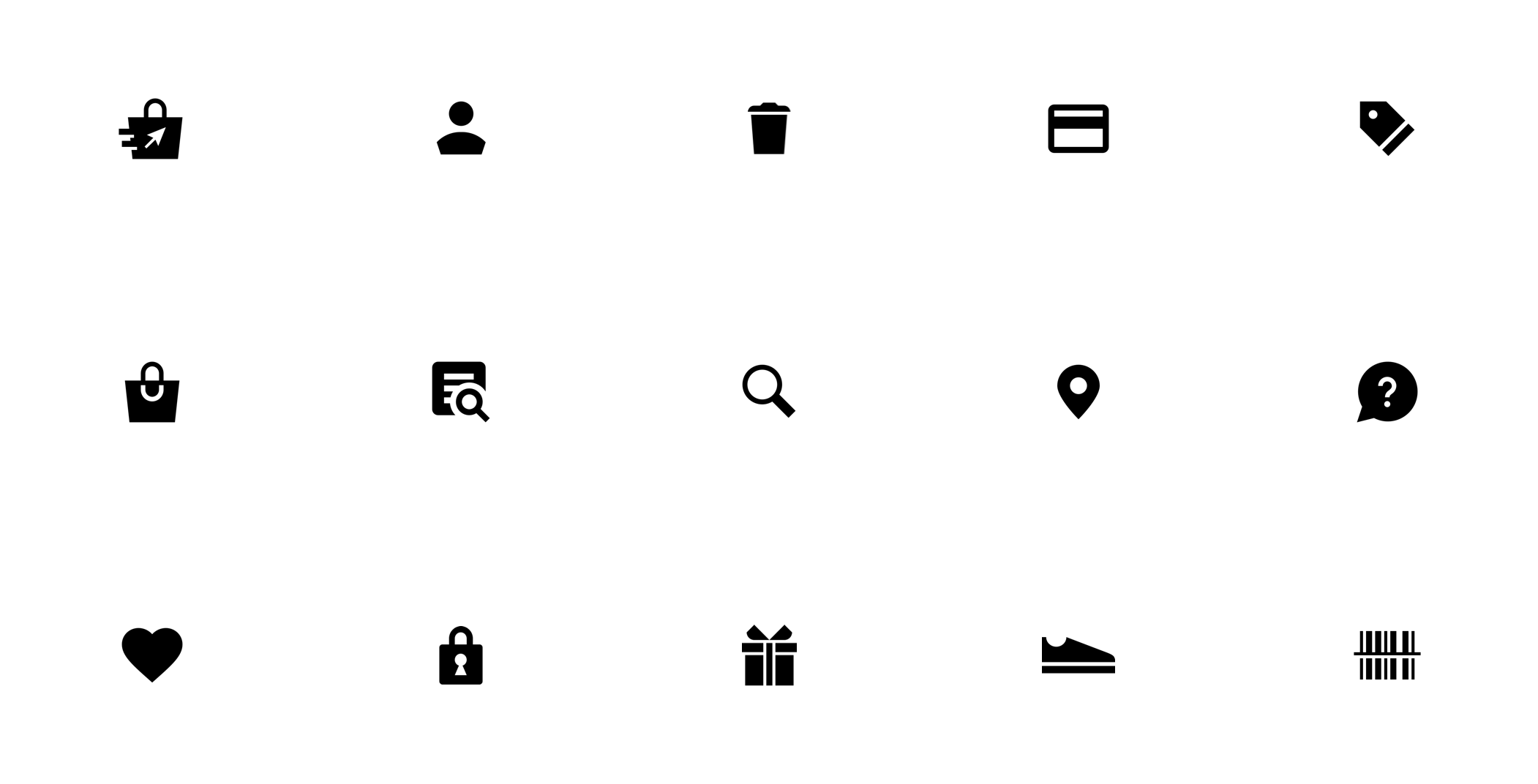
Cohesive Iconography
Icons graphically indicate action or emphasis and add personality to otherwise rote content. The set is designed with rigid, geometric construction.
Icons graphically indicate action or emphasis and add personality to otherwise rote content. The set is designed with rigid, geometric construction.
Icons graphically indicate action or emphasis and add personality to otherwise rote content. The set is designed with rigid, geometric construction.
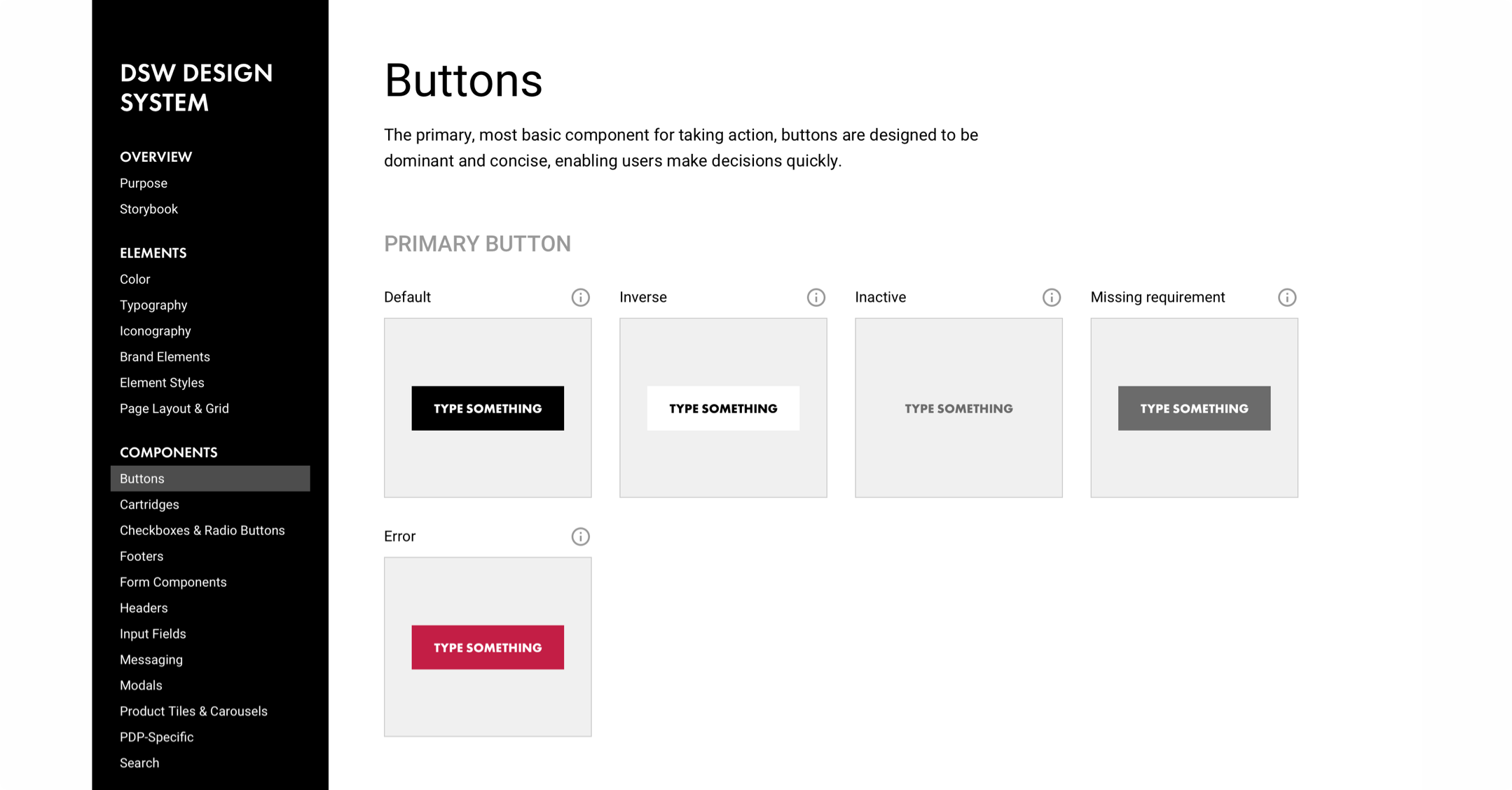
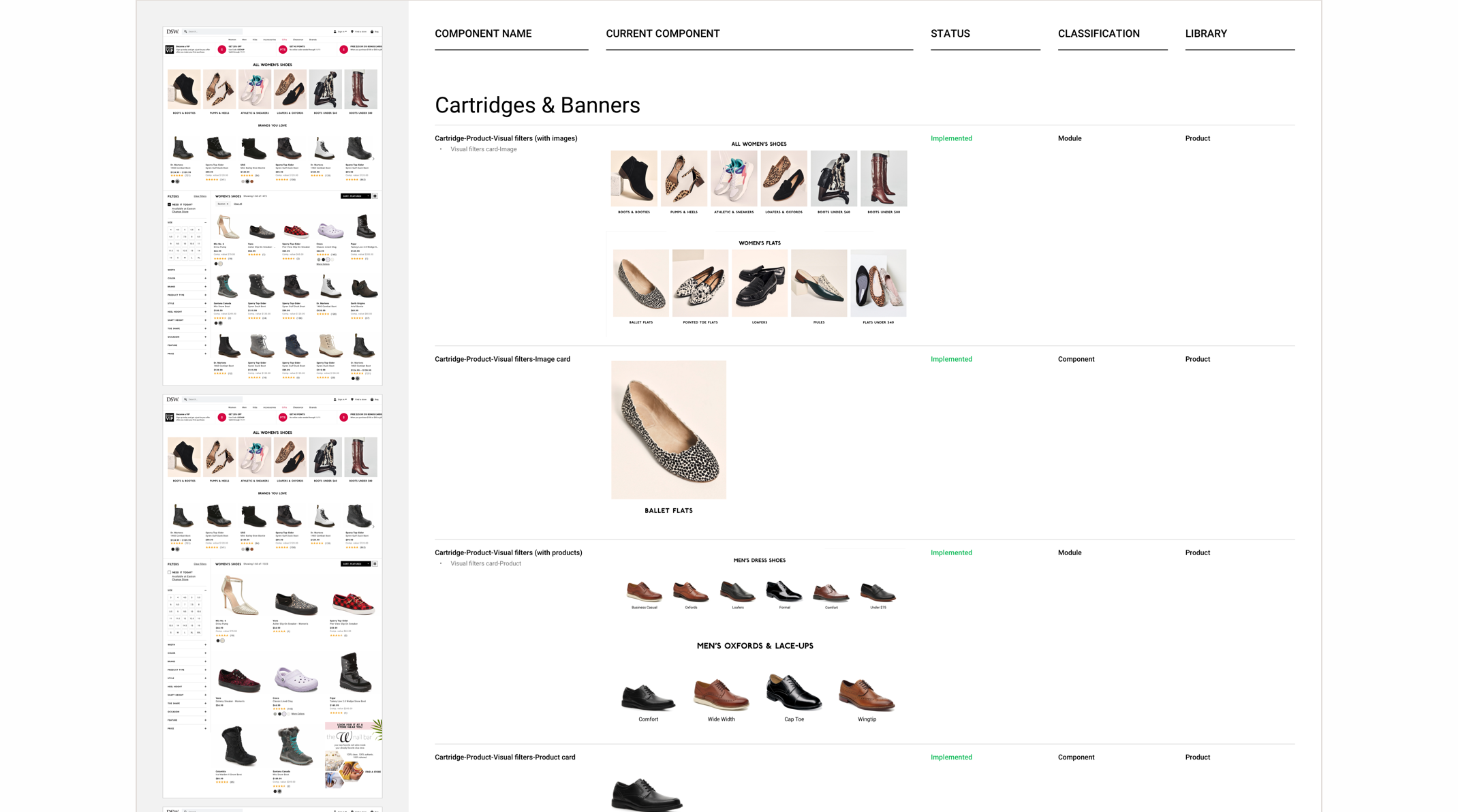
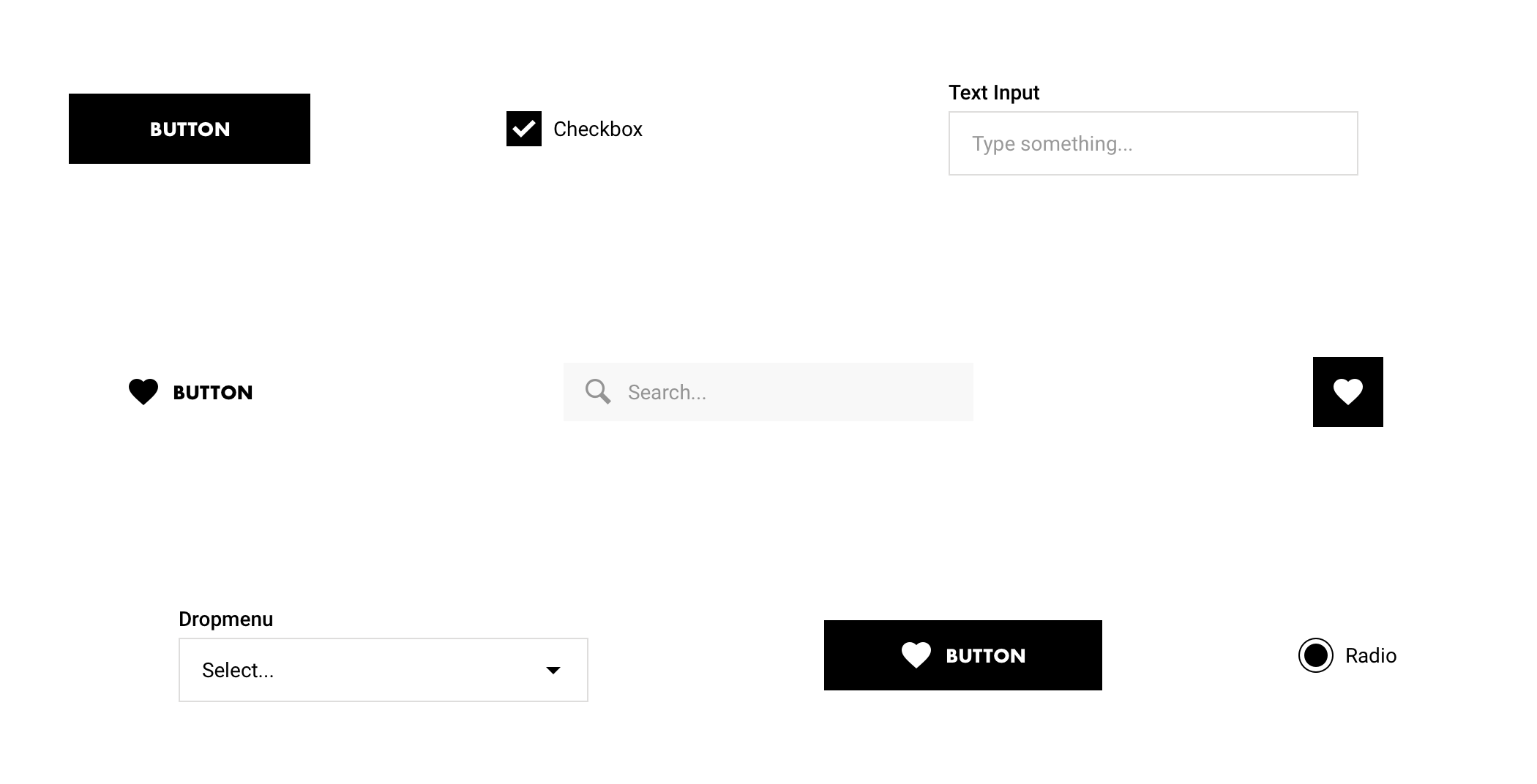
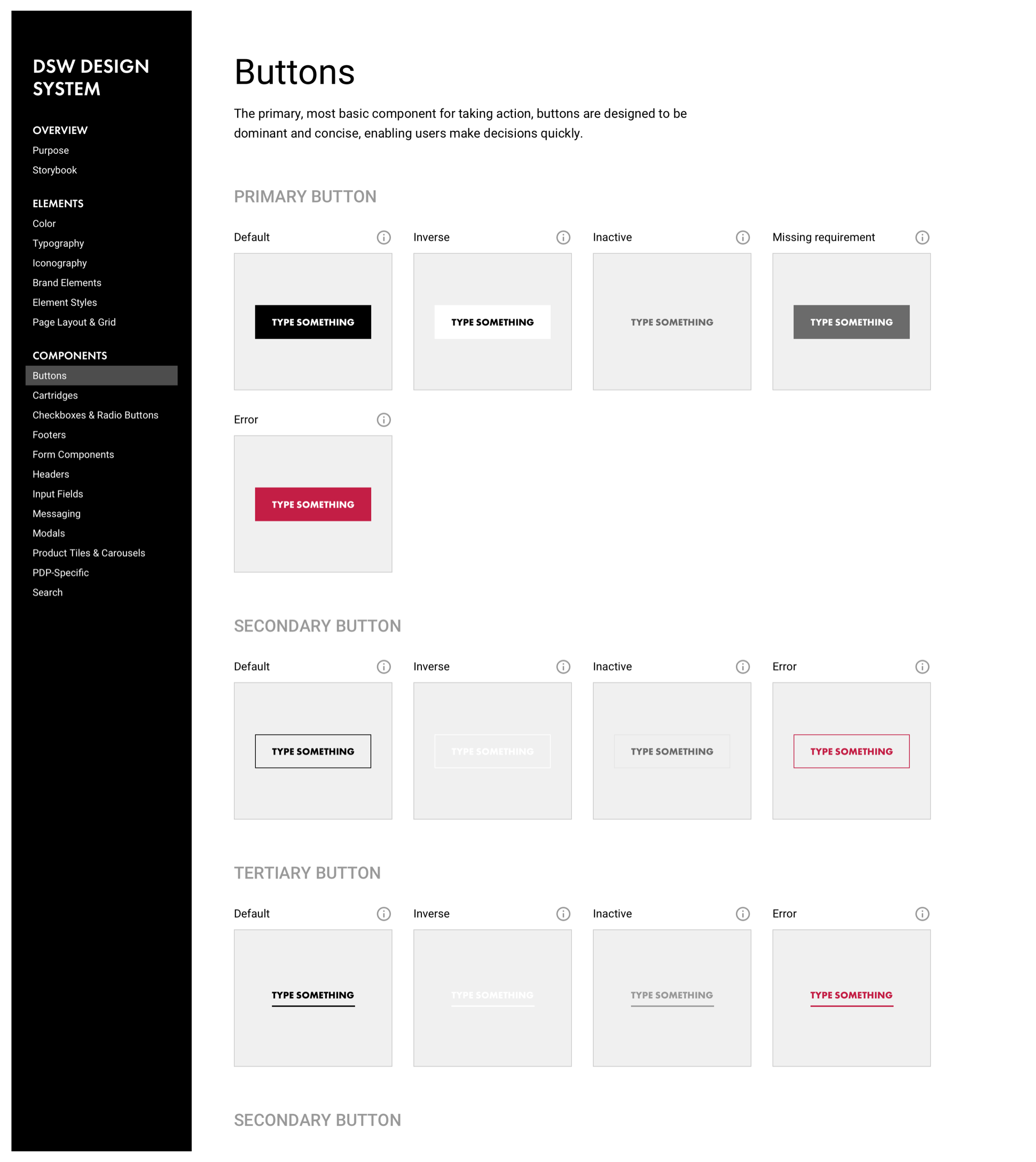
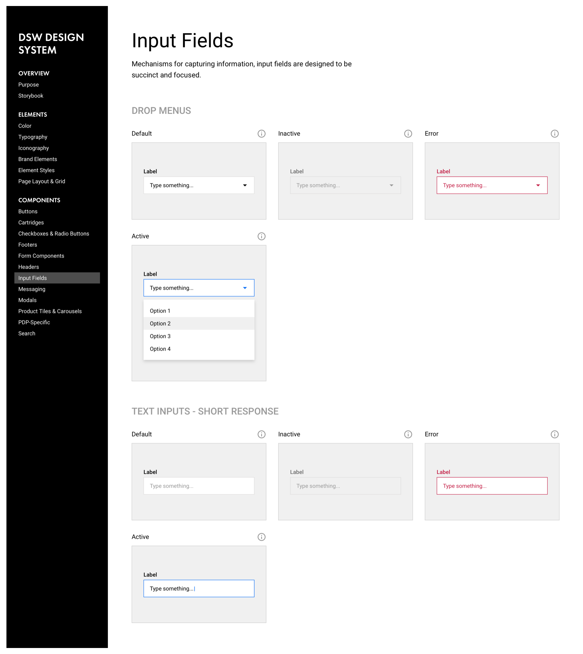
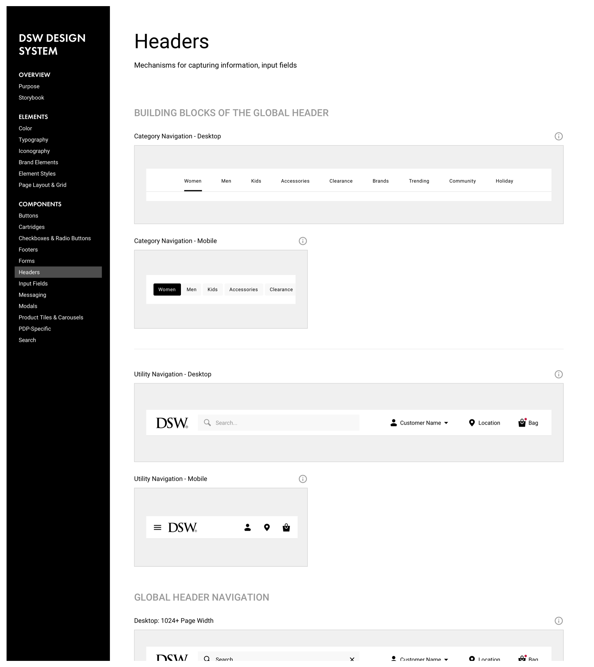
Intentional, Approachable Components
Components combine type and style standards to guide users toward taking action predictably and reliably.
Components combine type and style standards to guide users toward taking action predictably and reliably.
Components combine type and style standards to guide users toward taking action predictably and reliably.
Looking Ahead
To be clear, I didn’t design every element catalogued in the design system. Typesetting and component styling was a collective effort through trial and error in each UX designer’s work. Custom iconography was designed by the talented Studio Dixon.
Looking ahead, we recognize that a system like this is never “done” and we expect to evolve it over time alongside our product, especially by way of guiding principles and usage specs.
Ethan Leonow
© 2020. All rights reserved.