Optimizing Bag & Mobile Checkout
OPTIMIZING BAG & MOBILE CHECKOUT
OPTIMIZING BAG & MOBILE CHECKOUT
OPTIMIZING BAG & MOBILE CHECKOUT
For a global shoe retailer
For a global shoe retailer
For a global shoe retailer
Objective
To design a more intuitive, efficient, and trustworthy checkout experience that therefore increases conversion.
Design a more intuitive, efficient, and trustworthy checkout experience that therefore increases conversion.
Design a more intuitive, efficient, and trustworthy checkout experience that therefore increases conversion.
Outcome
Creation of a familiar, unified, and well-vetted checkout experience across customer touchpoints.
Creation of a familiar, unified, and well-vetted checkout experience across touchpoints.
Creation of a familiar, unified, and well-vetted checkout experience across touchpoints.
Year — 2019/2020
Year — 2019/2020
Year — 2019/2020
Company — DSW
Company — DSW
Company — DSW
Type of Work — UX design
Type of Work — UX design
Type of Work — UX design
Role — Lead UX designer, evaluative user researcher
Role — Lead UX designer, evaluative user researcher
Role — Lead UX designer, evaluative user researcher
Overview
Overview
Overview
The DSW UX team was approached to redesign the checkout flow with the goal of optimizing conversion. This came after several feature enhancements that lacked a holistic UX perspective, so we took it as an opportunity to create a cohesive transaction experience.
As the designer who worked most closely with all things transaction, I led the strategy and design of this effort.
Crafting a Design Strategy
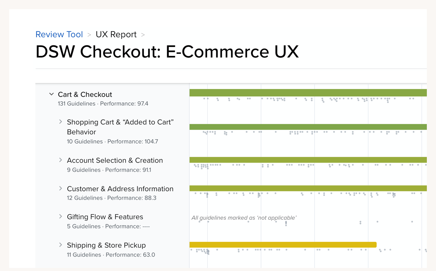
Many customers don’t convert because of needless points of friction in the checkout process. To identify and prioritize these, I scored our experience against the Baymard Institute’s 131 checkout guidelines.
Many customers don’t convert because of needless points of friction in the checkout process. To identify and prioritize these, I scored our experience against the Baymard Institute’s 131 checkout guidelines.
Many customers don’t convert because of needless points of friction in the checkout process. To identify and prioritize these, I scored our experience against the Baymard Institute’s 131 checkout guidelines.
Many customers don’t convert because of needless points of friction in the checkout process. To identify and prioritize these, I scored our experience against the Baymard Institute’s 131 checkout guidelines.
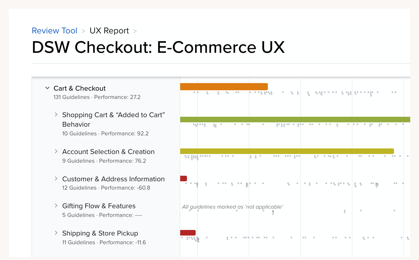
27.2
27.2
27.2
Poor/mediocre UX score according to Baymard's 131 guidelines
Poor/mediocre UX score according to Baymard's 131 guidelines
Poor/mediocre UX score according to Baymard's 131 guidelines
Baymard checkout audit results
Baymard checkout audit results
I then synthesized Baymard’s guidelines and created a list of principles. These were helpful for uniting the product team around a goal and for gut-checking concepts.
I then synthesized Baymard’s guidelines and created a list of principles. These were helpful for uniting the product team around a goal and for gut-checking concepts.
I then synthesized Baymard’s guidelines and created a list of principles. These were helpful for uniting the product team around a goal and for gut-checking concepts.
I then synthesized Baymard’s guidelines and created a list of principles. These were helpful for uniting the product team around a goal and for gut-checking concepts.
Six Principles for Checkout UX
Mobile — Optimize interactions for the majority of our shoppers first
Mobile — Optimize interactions for the majority of our shoppers first
Mobile — Optimize interactions for the majority of our shoppers first
Focused — Design page structure and navigation to frame customers’ expectations
Focused — Design page structure and navigation to frame customers’ expectations
Focused — Design page structure and navigation to frame customers’ expectations
Efficient — Streamline data entry through consolidation and automation
Efficient — Streamline data entry through consolidation and automation
Efficient — Streamline data entry through consolidation and automation
Informative — Validate critical data and communicate errors specifically and helpfully
Informative — Validate critical data and communicate errors specifically and helpfully
Informative — Validate critical data and communicate errors specifically and helpfully
Trustworthy — Design components that evoke transparency and security
Trustworthy — Design components that evoke transparency and security
Trustworthy — Design components that evoke transparency and security
Cohesive — Standardize design, placement, and language of checkout components
Cohesive — Standardize design, placement, and language of checkout components
Cohesive — Standardize design, placement, and language of checkout components
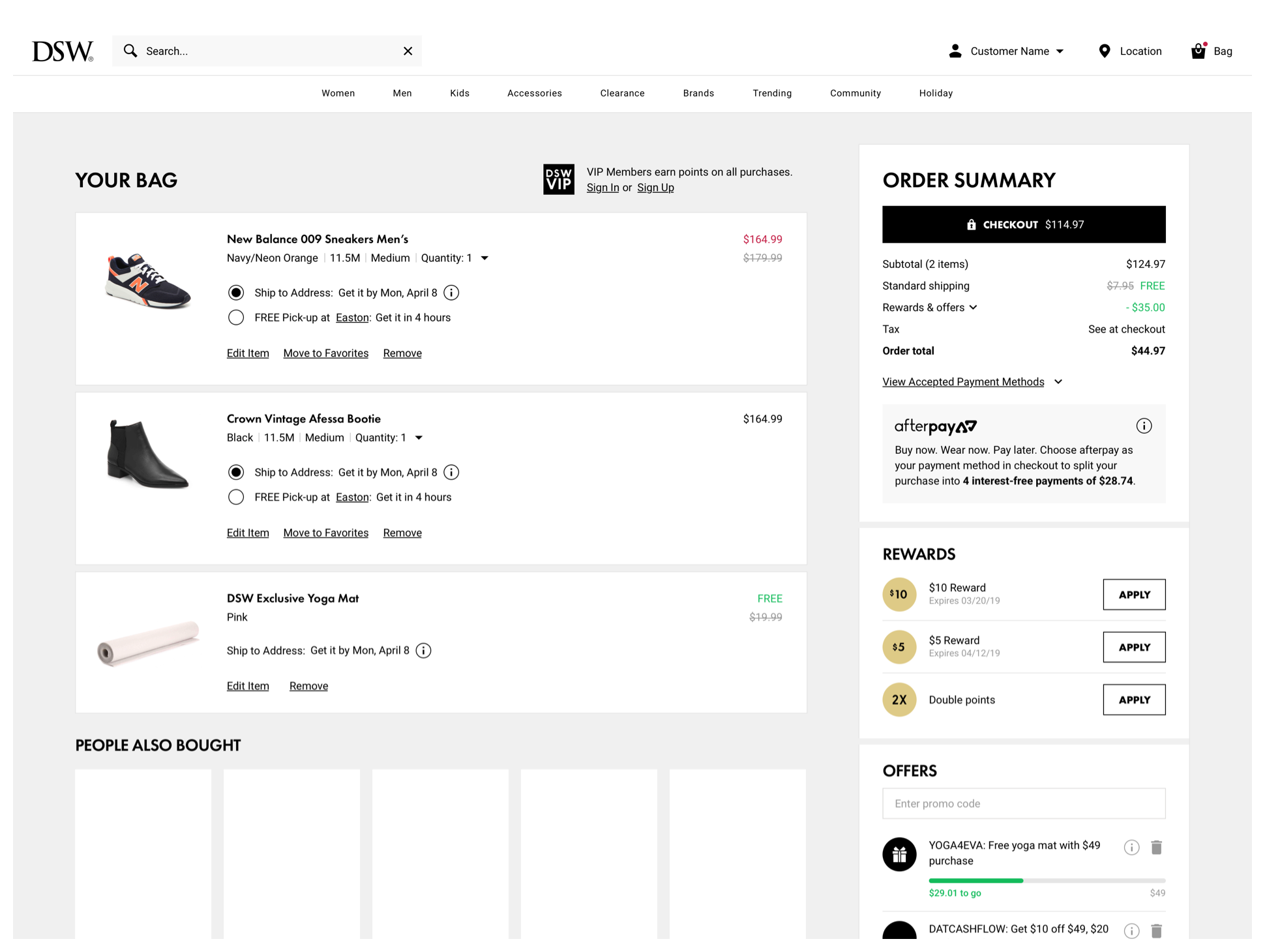
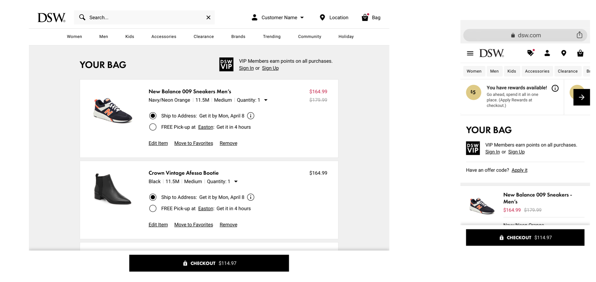
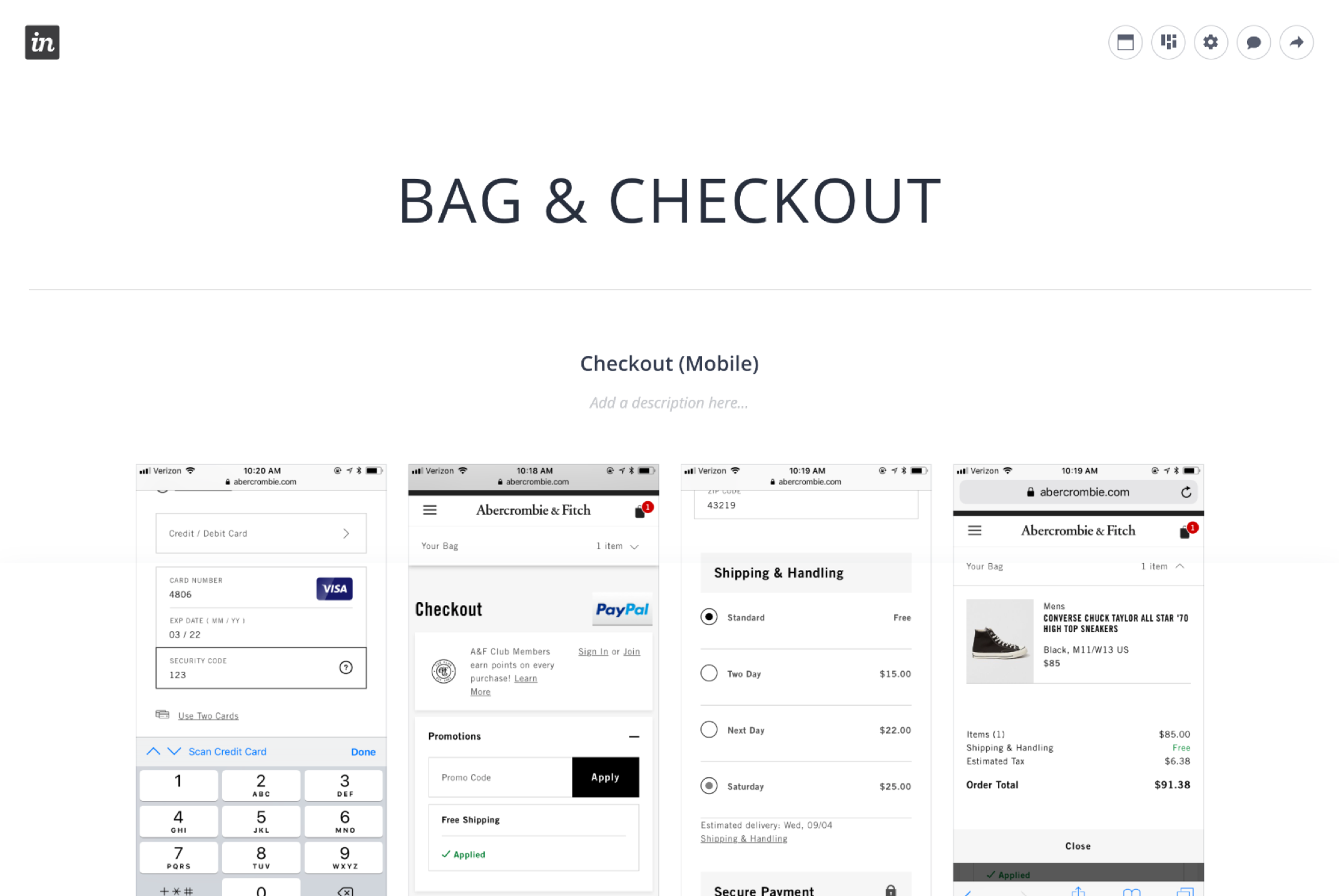
The Bag
The Bag
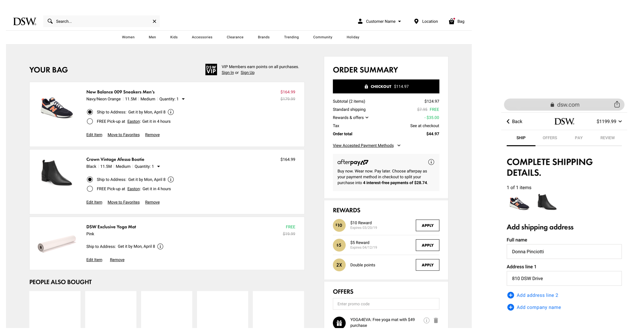
The first touchpoint in our checkout process is the Bag page. Our Bag needed better structured information, more obvious functionality, and a more thoughtful responsive design approach.
The first touchpoint in our checkout process is the Bag page. Our Bag had a good foundation but needed better structured information, more obvious functionality, and a more thoughtful responsive approach.
The first touchpoint in our checkout process is the Bag page. Our Bag had a good foundation but needed better structured information, more obvious functionality, and a more thoughtful responsive approach.
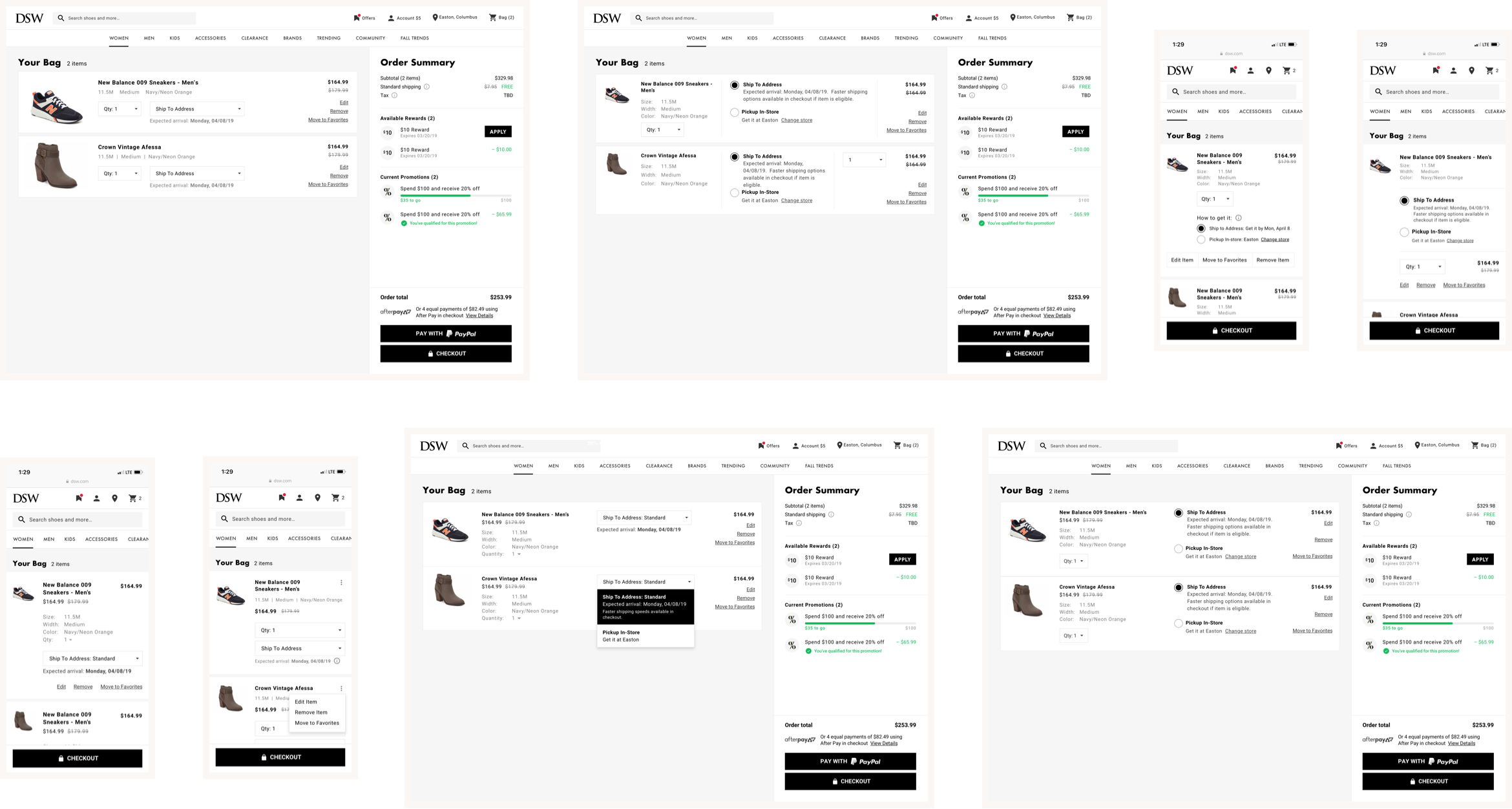
Bag wireframe exploration
A Holding Place
Items were designed with larger thumbnails, clearer content hierarchy, and visible editing features to assist in reviewing products added to the Bag.
Items were designed with larger thumbnails, clearer content hierarchy, and visible editing features to assist in reviewing products added to the Bag.
Items were designed with larger thumbnails, clearer content hierarchy, and visible editing features to assist in reviewing products added to the Bag.
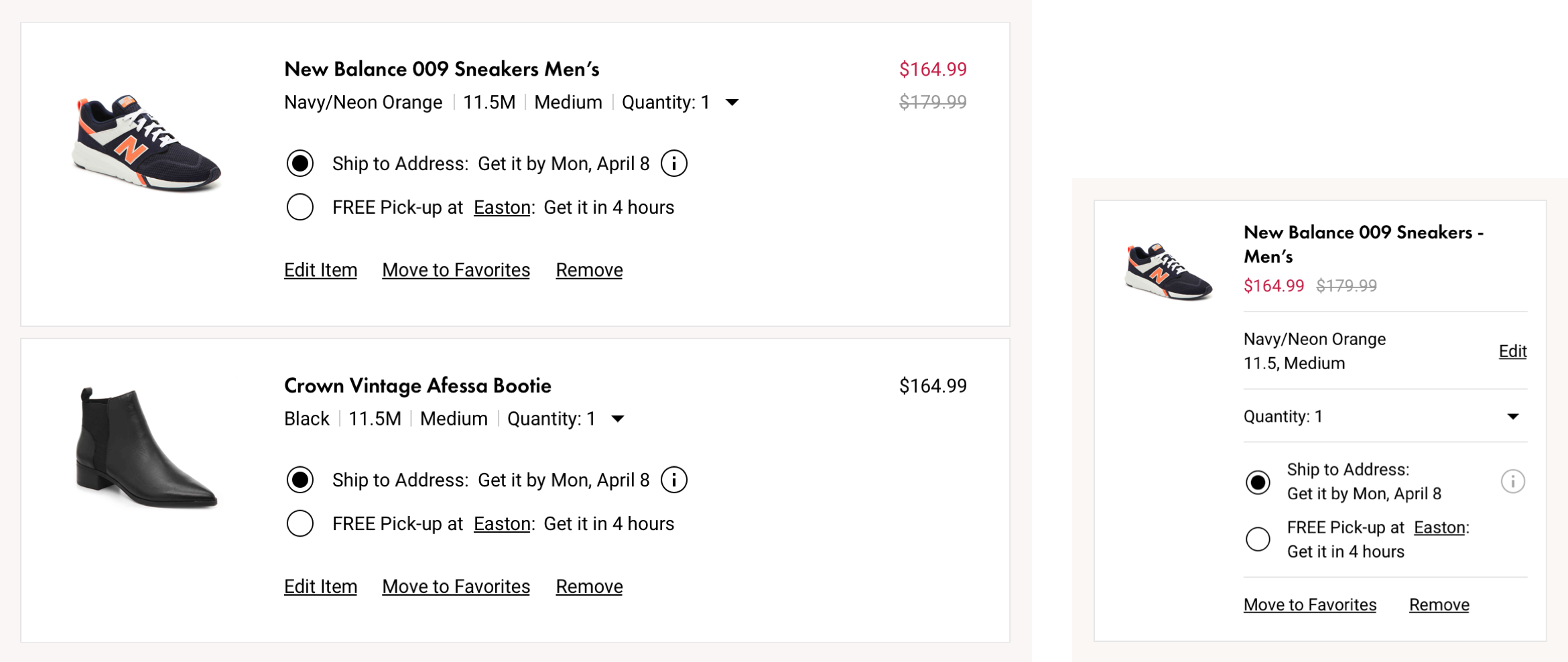
Desktop & mobile product cards
A Decision Point
A Decision Point
The order summary breaks down payment information for customers to clearly understand price. Additionally, a prominent checkout button is always within reach for when a customer is ready to buy.
The order summary transparently communicates payment information for customers to clearly comprehend price. Additionally, a prominent checkout button is always within reach when a customer decides to buy.
The order summary transparently communicates payment information for customers to clearly comprehend price. Additionally, a prominent checkout button is always within reach when a customer decides to buy.
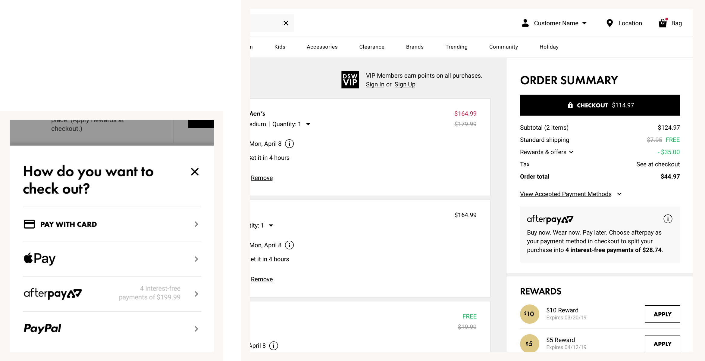
(Left) Mobile payment method menu + (Right) Desktop order summary
A Reinforcement of Value
A Reinforcement of Value
A Reinforcement of Value
Rewards and offers components were designed to simplify customers’ understanding of a diverse system of deals and offers. Basic interactions were stripped down to their essentials, while qualification and messaging elements were unified.
Rewards and offers components were designed to simplify customers’ understanding of a diverse system of promotions. Basic interactions were stripped down to their essentials, while qualification and messaging elements were unified.
Rewards and offers components were designed to simplify customers’ understanding of a diverse system of promotions. Basic interactions were stripped down to their essentials, while qualification and messaging elements were unified.
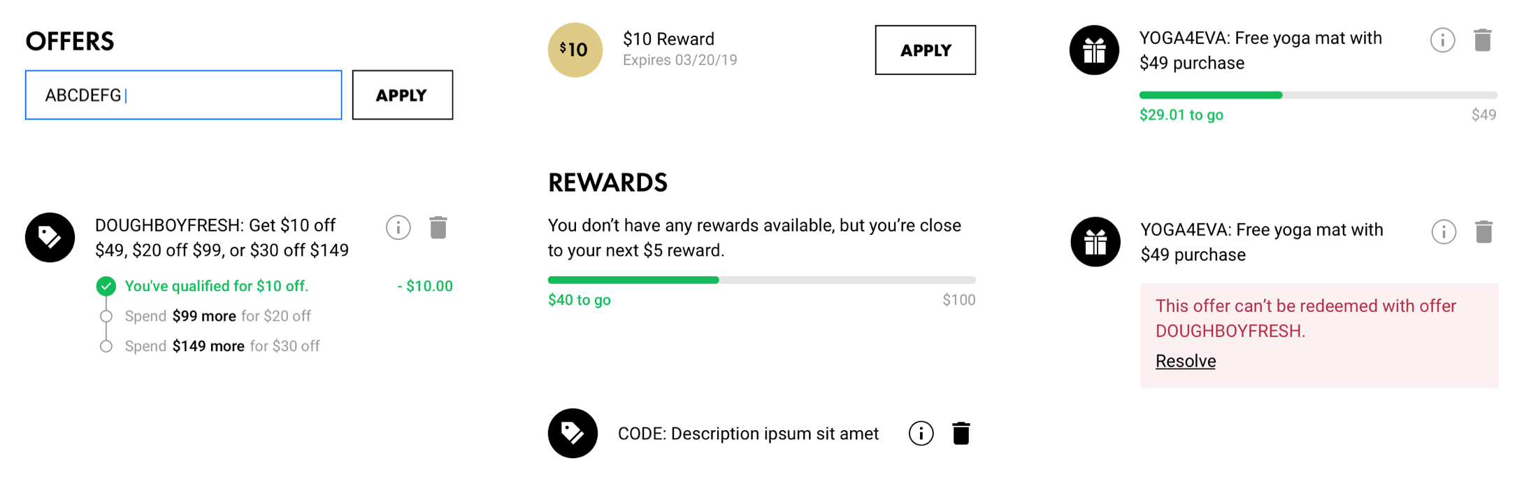
Rewards & offers components
Rewards & offers components
Mobile Checkout
To reiterate, the goal was to design a focused, efficient, informative, and trustworthy checkout. I solved for these criteria by designing and testing many wireframe prototypes of the entire checkout flow and micro-interactions within it.
To reiterate, the goal was to design a focused, efficient, informative, and trustworthy checkout. I solved for these criteria by designing and testing many wireframe prototypes of the entire checkout flow and micro-interactions within it.
To reiterate, the goal was to design a focused, efficient, informative, and trustworthy checkout. I solved for these criteria by designing and testing many wireframe prototypes of the entire checkout flow and micro-interactions within it.
Checkout design inspiration
Thematically Structured Content
DSW’s original checkout was a long, one-page form. Single-page checkouts aren’t always bad, but the combination of unrelated tasks made ours cumbersome and unfocused. The solution was to split the form into thematic sections.
DSW’s original checkout was a long, one-page form. Single-page checkouts aren’t always bad, but the combination of unrelated tasks made ours cumbersome and unfocused. The solution was to split the form thematically.
DSW’s original checkout was a long, one-page form. Single-page checkouts aren’t always bad, but the combination of unrelated tasks made ours cumbersome and unfocused. The solution was to split the form thematically.
Four Main Tasks of Checkout
01 — Account sign in or sign up
01 — Account sign in or sign up
01 — Account sign in or sign up
02 — Complete shipping and/or store pick-up form
02 — Complete shipping and/or store pick-up form
02 — Complete shipping and/or store pick-up form
03 — Complete payment information
03 — Complete payment information
03 — Complete payment information
04 — Review & place order
04 — Review & place order
04 — Review & place order
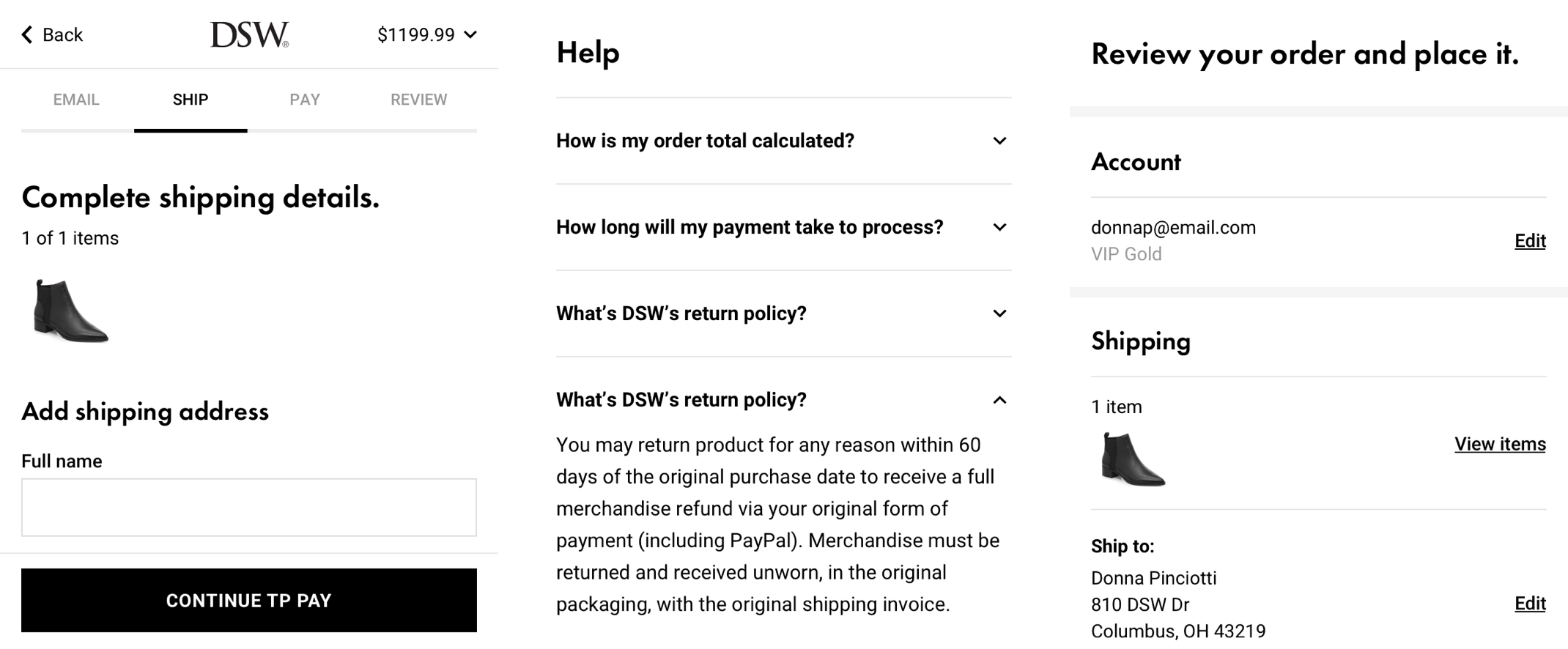
Multi-page Flow
Multi-page Flow
Multi-page Flow
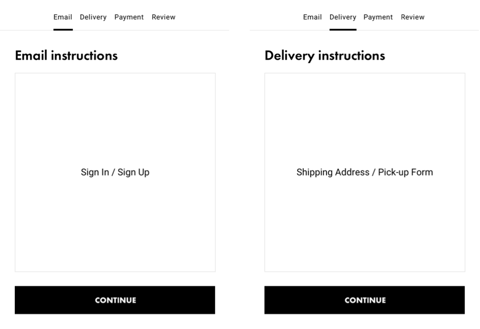
Accordion Flow
Accordion Flow
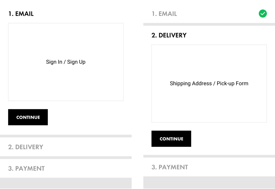
Comparison between multi-page and accordion designs
This four-part process could either be designed as a multi-page or a single-page, accordion flow. I prototyped both and tested them. The multi-page prototype was chosen because of its technical efficiency and clearer navigation.
This four-part process could either be designed as a multi-page or a single-page, accordion flow. I prototyped both and tested them around the office. The multi-page prototype was chosen because of its technical efficiency and clearer navigation.
This four-part process could either be designed as a multi-page or a single-page, accordion flow. I prototyped both and tested them around the office. The multi-page prototype was chosen because of its technical efficiency and clearer navigation.
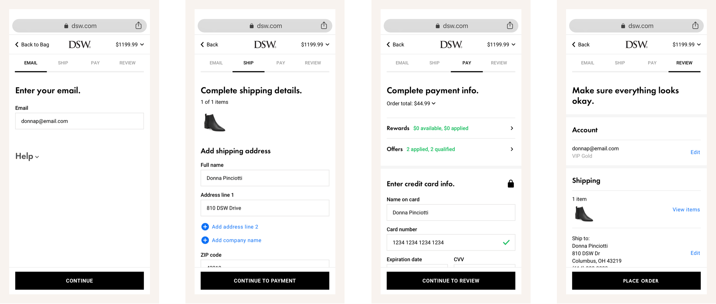
A four-part mobile checkout flow
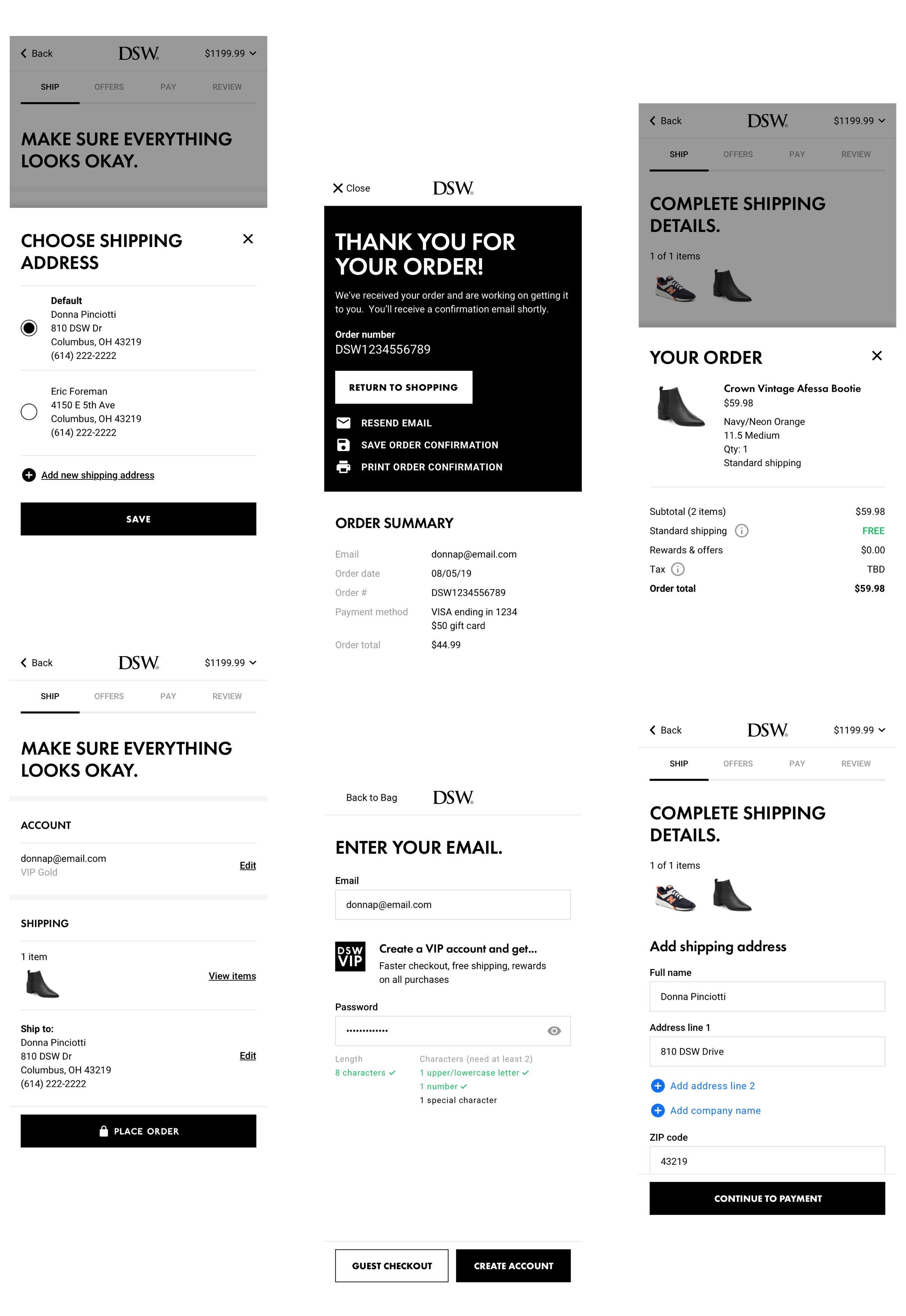
Adding What's Helpful, Removing What's Not
The multi-page experience was markedly quicker and more intuitive, but tests also revealed opportunities to further eliminate effort for customers. To solve for this, I prototyped ways to remove non-essential content, and to add contextual instructions and shortcuts.
The multi-page experience was markedly quicker and more intuitive, but tests also revealed opportunities to eliminate work for customers. To solve for this, I prototyped ways to remove non-essential content, and to add contextual instructions and shortcuts.
The multi-page experience was markedly quicker and more intuitive, but tests also revealed opportunities to eliminate work for customers. To solve for this, I prototyped ways to remove non-essential content, and to add contextual instructions and shortcuts.
(Left) Intuitive header & footer + (Middle) Help content underneath forms + (Right) Loyalty customers skip to Review
Evaluating the Design
Next, came testing the end-to-end design. First, I re-assessed the Bag & Checkout using Baymard’s guidelines. This time, we did well, a 97.4!, seeing the most improvement in form design and simplification.
Next, came testing the end-to-end design. First, I re-assessed the Bag & Checkout using Baymard’s guidelines. This time, we did well – a 97.4!– seeing the most improvement in form content design and simplification.
Next, came testing the end-to-end design. First, I re-assessed the Bag & Checkout using Baymard’s guidelines. This time, we did well – a 97.4!– seeing the most improvement in form content design and simplification.
97.4
97.4
97.4
(+70.2) Very good prototype according to Baymard
(+70.2) Very good prototype according to Baymard
(+70.2) Very good prototype according to Baymard
Baymard re-test with prototype
Baymard re-test with prototype
After the Baymard audit, I devised a test using an HTML prototype for evaluating learnability and efficiency with real customers. Overall, customers found the flow to be familiar and quick, but pointed out areas needing more simplicity and transparency.
After the Baymard audit, I devised a test using an HTML prototype for evaluating learnability and efficiency with real customers. Overall, customers found the flow to be familiar and quick, but pointed out areas needing more simplicity and transparency.
After the Baymard audit, I devised a test using an HTML prototype for evaluating learnability and efficiency with real customers. Overall, customers found the flow to be familiar and quick, but pointed out areas needing more simplicity and transparency.
Areas of Improvement
01 — Account for shortcuts users already take (e.g. browser auto-fill)
01 — Account for shortcuts users already take (e.g. browser auto-fill)
01 — Account for shortcuts users already take (e.g. browser auto-fill)
02 — Isolate account step from flow as a transition between bag and checkout
02 — Isolate account step from flow as a transition point
02 — Isolate account step from flow as a transition point
03 — Delivery speed and offers/rewards content are considered essential and shouldn’t be hidden
03 — Delivery speed and offers/rewards content are considered essential and shouldn’t be hidden
03 — Delivery speed and offers/rewards content are considered essential and shouldn’t be hidden
04 — Visually confirm changes in summary areas
04 — Visually confirm changes in summary areas
04 — Visually confirm changes in summary areas
4.7/5
4.7/5
4.7/5
Average tester confidence rating
Average tester confidence rating
Average tester confidence rating
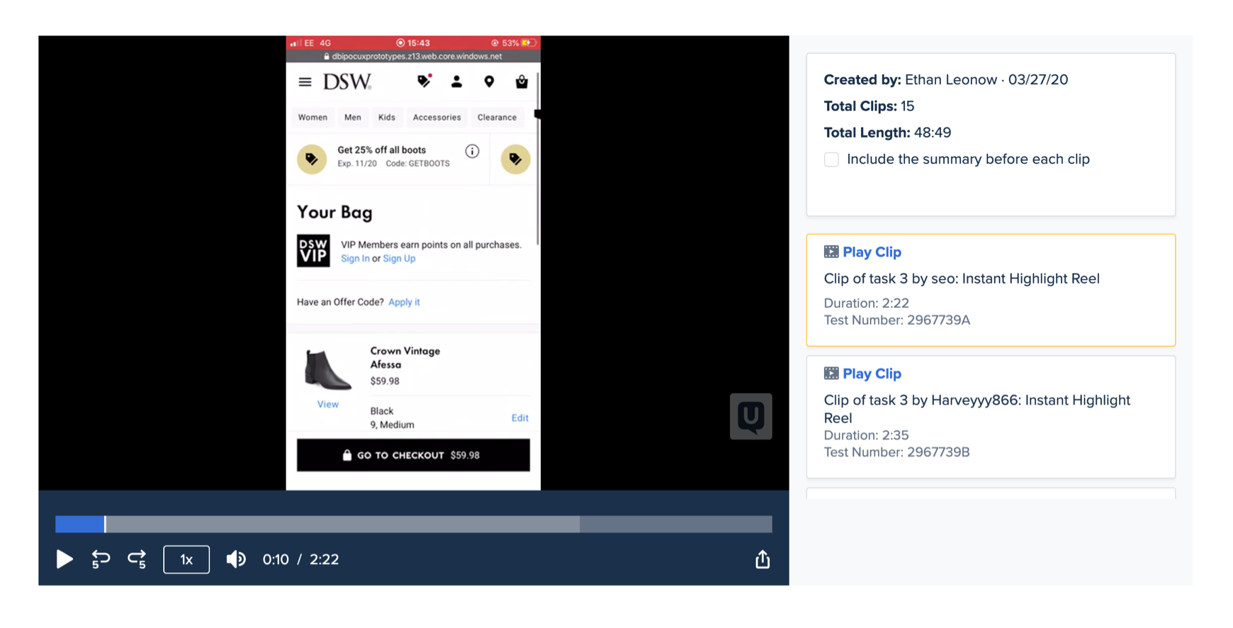
Analylzing user tests with UserTesting.com
Buttoning Up The Design
After customer validation, I worked with the product team to plan how to release changes in a low-friction way. This is where the project left off, but I’m excited to adapt the designs for desktop and to monitor its impact after development and A/B testing.
After making changes based on testing, I worked with the product team to plan how to release changes in a low-friction way. I also designed other transactional touchpoints like order emails.
This is where the project left off, but I’m excited to adapt the designs for desktop and to monitor its impact after development and A/B testing.
Ethan Leonow
© 2020. All rights reserved.